Darren Palmer on 2019 interior design trends
Celebrity designer and judge for TV show The Block Darren Palmer reveals the hottest colour for 2019 and other design trends for the year coming up.
When you think of coral, images of island time and snorkelling on the Great Barrier Reef likely conjure in your mind.
That’s along the lines of what Pantone would like you to envisage when thinking about their Colour of the Year for 2019 as being Living Coral, which they say is an “animating and life-affirming shade of orange with a golden undertone”.
Pantone Color (sic) Institute executive director Leatrice Eiseman said in reaction to the onslaught of digital technology and social media increasingly embedding into daily life, they sought authentic and immersive experiences enabling connection and intimacy.
“Colour is an equalising lens through which we experience our natural and digital realities and this is particularly true for Living Coral,” Ms Eiseman said.
“With consumers craving human interaction and social connection, the humanising and heartening qualities displayed by the convivial Pantone Living Coral hit a responsive chord.”

Pantone, provider of professional colour standards and digital solutions for the design industry, announced PANTONE 16-1546 Living Coral as the Pantone Colour of the Year 2019.Source:Supplied
Design guru and The Block judge Darren Palmer couldn’t agree more, and said interior trends for 2019 were about getting back to nature.
Palmer said coral was used everywhere in Brisbane’s newest trendsetting hotel, Calile, in Fortitude Valley.

Darren Palmer says The Calile Hotel is a perfect example of the trends and colours to expect in 2019. IMAGE: Sean FennessySource:Supplied
“It has been paired with beige neutrals, travertine and brass and that is a good indication of the type of colour trend for 2019,” Palmer said.
“We will also probably see saturated, mid toned primary and secondary colours in a 2019 way that are an evolution or reinterpretation of the Memphis period.

The Calile Hotel has paired the colour with beige neutrals, travertine and brass, which is a good indication of what to expect in 2019. IMAGE: Sean FennessySource:Supplied
“Memphis is a design movement that began in 1981 in Milan, Italy, by designer Ettore Sottsass.
“Everything 80s and 90s is being reinvigorated with a blend of our contemporary aesthetic so be prepared to see things that would have made you cringe appear in new and innovative ways that are aesthetically pleasing.”
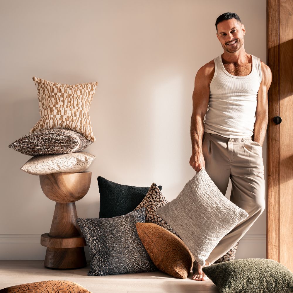
Palmer said there would always be a place for wall papers in florals, botanicals and palms and green would continue to be everywhere you look.
“If you are fortunate enough to live near nature, green is everywhere and has so many variations, from apple and lime to eucalypt, sage, avocado and olive,” he said.
“For the G.J. Gardner Tailored Collection I designed recently, I used Laminex Possum on the kitchen and bathroom cupboards in one of the house designs.
“It’s a brand new eucalypt colour from Laminex and a great celebration of what’s great about Australian nature and how green is so dominant within it.”

One of Darren Palmer's latest designs which will be on trend in 2019 — Surge gold quilt and palm leaves wallpaper.Source:Supplied
He said there were no hard and fast rules regarding the application of colour.
“But the one important thing to get your head around is the difference between dominant and recessive colours,” he said.
“Dominant colours like green, yellow and red will feel like they’re jumping forward, while recessive colours like purple and blue will feel like they’re going back.
“Pairing dominant and recessive colours can be used to create focal points in a room, create an illusion of depth and space, or draw attention to statement pieces.”
Palmer said in the past people painted feature walls in a dominant colour to add drama to a room — but feature walls were about 10 years out of date.
“Painting doors or picture rail is a much more effective way to add a splash of colour and to separate spaces,” he said.

For the G.J. Gardner Tailored Collection Darren Palmer designed, he used Laminex Possum on the kitchen cupboards. It’s a brand new eucalypt colour from Laminex and a great celebration of what’s great about Australian nature and how green is so dominant within it.Source:Supplied
“Or if you’re really afraid of colour, think about buying some cost-effective soft furnishings and decor items that add a splash of colour — these are easily replaceable as trends shift or you decide you want a change.”
He said demand for custom designed furniture would continue to surge in 2019 as people wanted items that reflected their lifestyle.
“It’s a reaction to the mass produced furniture that has the same-same look,” he said.
“People are looking for an artisan, handmade, bespoke response to furnishings.
“While the major furnishers do their job well, there is increasingly a place for Australian handmade furniture and craftsmanship within a home alongside some of the more commoditised and popular retailer branded furniture.”
Leave a comment