Darren Palmer’s 5 Top Bathroom Makeovers

Don’t let your budget, space or vanity (cabinet) stop you from having the bathroom of your dreams. Check out Darren Palmer’s top bathroom makeovers for inspo’, design tips and a load of stunning styles at every budget.
Darren Palmer may have launched to fame as a beloved judge on The Block, but it’s behind closed doors that the interior designer and author really shines. In his new book, Homespace, Darren gives us backstage access into some of his renovation and makeover projects, sharing his insight, design strategy and aesthetic approach. So you can learn how to transform your home into a beautiful and functional space that reflects your personality, and suits your needs, lifestyle and budget. Here’s a taste of the design fundamentals behind these bathroom transformations…
Project 1: Limestone & Mother of Pearl Feature Mosaic Tiles
“This ensuite bathroom started with a mother of pearl mosaic tile we found very early on while looking for the initial limestone, and immediately became a must-have to be worked around,” explains Darren. “Because it’s so flamboyant and the house was the opposite, the rest of the interior finishes of the ensuite really needed to be restrained, to be pulled back in terms of gloss level, texture and interest.”
“In contrast to the small mosaic wall tiles which look handmade with their irregular shape, the bathroom floor tiles are large and almost painterly with their brushstroke texture.”
“A bathroom isn’t an island. It doesn’t stand alone, an oasis in the desert of the creative process, existing without consequence to the rest of the home. Its finishes need to work with other bathrooms in the home. It needs to have some dialogue and commonality with the kitchen, and it needs to work in harmony with adjoining bedrooms so it appears to belong together.”


Choosing the right tiles
“The tiles here look a little like an oversized woven travertine basket, and add texture and amazing interest into an otherwise pulled back and restrained bathroom. The tiles aren’t an everywhere tile either, not just for the fact that they’re really quite bold, but also because they’re a cleaning nightmare – another nod to the fact this is a home for two people and their occasional guests. If the bathroom was occupied regularly, the cleaning might just break your heart, but they’re in a room that’s used by friends dropping by for a glass of wine or a cup of tea, not handled by youngsters rushing to school.”

Project 2: Structural changes & renovating
“This main bathroom needed a reasonable amount of attention – most of it was cosmetic, but I did have to do a little work on the ceiling to even things out. The ceiling was high, but a structural beam running along the top of one of the walls ruined the symmetry of the room.”
“The first thing I suggested was to make sense of the appearance of the beam by creating a series of bulkheads the same depth and height as the supporting beam on the other walls. The same was done in the toilet, creating a really neat solution to something that was actually more architecturally obstructive than interesting.”
“That’s the thing with architectural challenges; sometimes cover-ups can actually highlight things that might otherwise be seen as drawbacks. The key is to figure out which bits to be non-apologetic about and which things need to be covered, replicated or disguised.”
Working what you have
“Apart from that, the bathroom was more in need of a lift than anything else. It had a lovely original bath and vanity, but they were worn from years of use, as were the marble tiles. The bath and vanity were resprayed with enamel – a great way to freshen up a bathroom quite economically and easily. If we’d had to pull out the bath, that would have meant removing tiles, dealing with waterproofing and a whole raft of expenses and time delays. We didn’t change tapware and accessories, as they were in working order and were quite a sweet and appropriate shape and style.”
“The floor and wall tiles were buffed and regrouted, and sealed, so that the new marble surface will be protected for several more years. Both resurfacing solutions will need to be redone every so often; it’s worth weighing up if the short-term fix is better than a complete renovation.”
“A new border tile and feature tile continue above the existing wall tiles right up to the ceiling. They tie in with what was already there, and look as if they were always meant to be.”
“A new vanity mirror, plus a new floor-to-ceiling mirror in a corner, help make this a more practical space.”
“The bathroom door had a lovely frosted pane of glass; this looked elegant and also provided privacy. The funny thing, though, is that the bathroom window is located in the shower recess. It was also clear glass, facing the neighbours and at torso height. The obvious thing to do was to use the frosted pane detail from the door. A frosted glass film with the same dimensions and pattern was attached – a simple, quick and easy solution.”
“A swish new glass shower screen replaced the shower curtain, and with that the room was complete. All in all, the bathroom refresh happened within a few weeks with minimal disruption, the only serious inconvenience occurring when the bath and basin were resprayed and the sealant on the tile was drying for a day.”

Project 3: Industrial luxury with utility
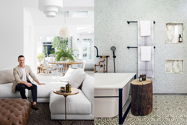
“For this project, the bathrooms are a blend of luxury and utility, with exposed brickwork making an appearance, set against a palette of encaustic tiles, copper basin and marble tiles. The final flourish comes from the exposed plumbing that snakes down the wall and finishes in matt black tapware. The bathrooms are really heaven on a stick; each one gets a variation on the theme with one having the encaustic tiles, another concrete hex tiles, while another has a concrete floor.”


Project 4: Double duty space saver
“When it comes to squeezing more into a space, this upstairs ensuite bathroom has to be a serious contender for some credit on how to get lots of amenity into a tiny room.”
“The downstairs bathroom was the wrong length for a shower and bath unless I put one in the other, which would not have been in keeping with the aesthetic of this home. The only way to include one, apart from locating it out on the balcony, was to put it in the ensuite.”
“The ensuite had room for a double-basined vanity, also bought off the rack online for a great price, a set of two showerheads, and all the normal accessories required for a bathroom to work day to day. With storage at face level, storage built into the vanity and even underfloor heating, this little bathroom was like the Tardis, seeming far bigger once you stepped inside it than it did from the outside.”


Article by: www.frankihobson.com


Leave a comment