Changing switches changed my home’s visual appeal


A little while back I painted my house and feeling very proud of myself I uploaded a progress shot of my freshly white new interior with the dark navy doors getting their first coat. I was chuffed with the transformation but one comment on my post threw me for a six.
"I hope you're going to do something about those old yellowed light switches!".
Ouch. I really thought I'd refreshed the house considerably but in making some parts nicer the old bits really stood out, as pointed out to me by some well-meaning follower.
This got me thinking. I really should try to get everything looking better, which did in fact mean having white switches instead of tired old oxidised yellow plastic. I then cast my eye around my house and thought, well if you're going to do something you might as well do it well. What a can of worms that turns out to be, it's like tugging on a loose thread.
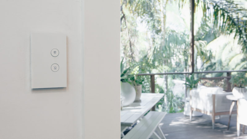
You see my favourite switches that I'd seen working on The Block were the matt white Clipsal Saturn Zen (not to be confused with the also lovely Clipsal Saturn range which is glass faced and shiny).
There are several things I love about the look of these switches, mainly that they are sharp and architectural looking, set off the wall with a neat black shadowline and featuring a really lovely smooth matt white plastic surface that works really well in many types of interiors.
The other visual appeal that you only really start to understand when you get a lot of functionality in your rooms is the lack of need for dimmers when using these switches. Previously I had a 6 gang switch, with an on/off switch for two lights, dimmers for the same two lights and a fan on/off switch as well as the speed dial to control the fan to boot. From a design point of view those switches look very busy on architraves and should you ever need more than 6 switches/dials, or "gangs" as they're called, you need to double up on the switch plates which takes up even more valuable real estate on your architraves.
With the Saturn Zen however the 6 gang switch I described before gets dialled back to a 3 gang, one flush-faced button to switch on or off each light which also dims elegantly when you hold it down plus one simple dial that controls the fan.
Throughout my home the switch plates all become more streamlined, by reducing the switches and knobs by roughly half, by this relatively simple change.

The other great aesthetic benefit of the Clipsal Saturn Zen in particular is the neat pictograms that they have for basically any and every function you might have in your house. Instead of trying to remember, or more-often-than-not guess, which switch did what I now have a neat picture of stairs to tell me that light is for the staircase. There's robe, BBQ, dining, kitchen and any number more beautifully designed little pictures that help you make sense of all the various functions and buttons throughout your home.
Whilst upgrading the switches it would have been messy to leave the old power points in place so I specified the same range using a few more 4 gang GPOs where I needed a bit more power, like in the AV area or in the kitchen.

The net effect of the simple changing of these practical and functional points in the home though is one of freshening up the entire house in line with the newly refreshed other areas. Unfortunately for me though now it's obvious that my door handles have to be upgraded. Like I said, it's a can of worms.


Leave a comment